Why do we use colour in art?
Colour is really ‘the place where our brain and the universe meet’, as Paul Cézanne put it. Can we imagine painting without colour? Of course not; even monochrome painting actually deals with colour. White is a colour, as is black. Monochrome painting is yet more proof that painted colour is a more powerful medium than the plot in literature or composition in graphic works.
And while painting is unthinkable without colour, colour without painting is triumphant in modern art. Artists no longer need canvas or oils to reproduce colour and dye the ambient medium. They exploit its effect on human perception to create harmonious or disturbing colour spaces.
First, colour is dispensed with the need to portray. It continued as a means of expression only. ‘Many colours have been described as rough or bristly, others as smooth and velvety, so that one feels inclined to stroke them (e.g., dark ultramarine, chromic oxide green, and rose madder). Equally the distinction between warm and cold colours belongs to this connection’, Wassily Kandinsky wrote in his book entitled Concerning the Spiritual in Art.
A founder of non-figurative painting, he believed that the future of visual art would consist in more complicated and personalised colours. Despite being an innovative artist, he followed the tradition in that regard, saying that the painting was essentially the art of mixing colours. Painting in ‘open colour’ was senseless and sordid, and ready-made colour was derogatory to the artist’s dignity.

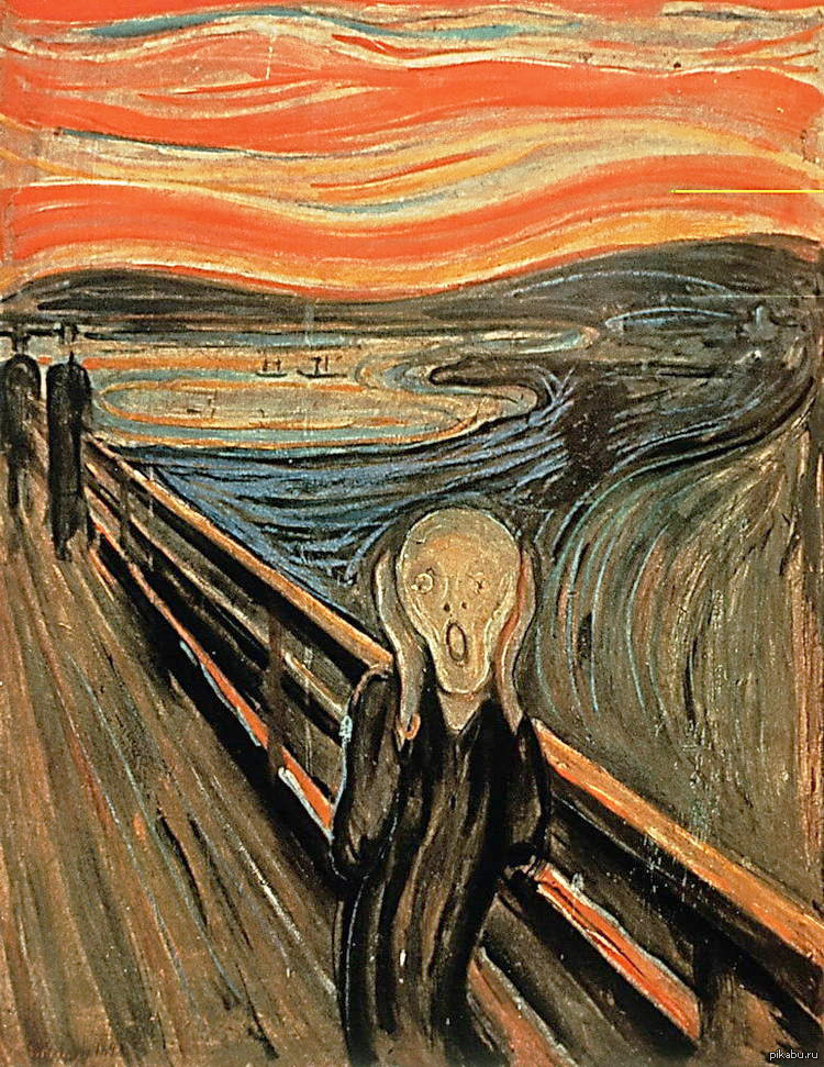
Edvard Munch, The Scream, 1983
The evolution of colour perception
Classical painting would create colour, among other things – as the pigments multiplied technically (here artists were assisted by alchemists and then chemists) and as their artistic creeds developed. For example, a shade of viridian is still called Veronese green because Paolo Veronese of Venice made ample use of this colour.
Artists no longer had to prepare their colours on their own, as Renaissance masters did. The painter’s palette broadened greatly – in the direct sense of this word. Virtually any shade could go on sale as a ready-made pigment.
Any special colour was now presented as something pertaining to the concept – like in works, and not very infrequent ones, painted with the artist’s blood. But that was rather an exception; painters would be happy to use factory-made colours, including printer’s ink, which op-artists like Victor Vasarely started using and pop artists like Roy Lichtenstein continued.
Just like the Ready Made object appeared to substitute the sculpture, Ready Colour came to replace harmonically mixed colour. Aggressive open colours came into visual arts as a reliable way to grab attention. The riot of reds and fluorescent yellows became a more accustomed means of expression than tranquil ochre, sienna, or idyllic azure. Colours’ names are now invented by marketologists rather than artists, like the orange-red Rouge d’Hermes named after boxes of perfume of the same name.
Modern culture seems colour-laden, and many resist its colour pressure. The best example is black-and-white photography that has become a synonym of art – as opposed to commercial colour pictures. This antithesis is both primitive and unjust, but still many photo artists favour austerity and prefer to see the world black-and-white. ‘I believe that the essence of photography is black and white’, says Sarah Moon, a French photographer. ‘Colour is but a deviance…’ So if she uses colour at all, it’s the artist’s colour, ‘colour without colour’, as she puts it.

Victor Vasarely, Vega 200, 1968
Colour is a subjective category based on personal interpretation
It is also important that the perception of colour is just as personal as the perception of music. This results from different colour stereotypes (for example, the colour of mourning is different in the East and West; we mourn in black, and they mourn in white) and simply from physical and psychological differences between people who are born with a rather primitive perception of colour and develop through their lifetime, like good ear for music is developed.
It is hard to imagine what would happen to classical painting if our colour vision changed one day and coloured objects became monochrome. Perhaps it would not terminate the history of art, but it would certainly make us revise all museum reputations. The Greeks once painted their statues that we now see in white marble. The disappearance of colour has certainly altered our perception but failed to force the art out of existence. Yet the canvases by Piet Mondriaan are too closely associated with colour to survive its disappearance.
The ‘colourful!’ and ‘non-colourful!’ verdicts given by Art Academy professors to their students would make the would-be artist permanently dependent on colour. Hence his desire to tame colour, to get a perfect command of it. In practice, only typographers could do this using detailed Pantone colour maps. Still, even catalogue colours could spring a surprise on their author and deviate from the expected colour when on paper. There has been no ideal colour in nature; it would always be diluted or tinted, resisting the brush, the typographer’s roller, or airbrush. Still, ideal colours would be arranged on both canvas and paper, like elements in Mendeleev’s periodic table. Artists of all times were noted for their desire to parade colours – especially in the past century. We can remember the experimental colour tables developed in the 1920s by artists led by Mikhail Matyushin, on whose basis a special Reference Book on Colour was published in 1933. Those para-scientific exercises were reflected in modern art’s colour points from Damien Hirst or ‘colour tables’ by Gerhard Richter.
It is not just an assumption that more than 200 million people around the world are colour-blind. They see visual art in a different colour scheme but still they don’t renounce it. One of the most cynical but funniest works on this topic belongs to Yury Albert. His series entitled Painting for the Blind consists of big white canvases with relief. In Rainer Maria Rilke’s words typed in Braille they describe canvases by Paul Cézanne. But here canvas is at least retained to carry colour, if ‘colour for the blind’.

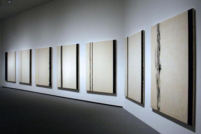
Barnett Newman
Colouring the world
In an epoch where spatial installations are preferred to flat canvas, colour bursts out of the plane to fill space and affect our feelings directly. That was essentially predicted by Kandinsky as he spoke about ‘chromotherapy’: ‘Repeated attempts have been made to use and apply the power of colour to treat various nervous ailments, and it was again noticed that red colour stimulates and excites the heart while blue colour can cause temporary paralysis.’
Kandinsky’s colour studies were poetic rather than purely scientific, but at the Bauhaus, where he taught painting, his ideas developed into theoretical works like The Art of Colour by Johannes Itten and practical designer advice by Walter Gropius who said that in rooms carpeted in orange, stenos would catch fewer colds than at an office with blue walls.

The Art of Colour by Johannes Itten
Designers pondered on rational uses for colour’s features, but artists were tugging into the irrational. Op art, pop art and kinetic art used spatial colour that is of no applied meaning and disturbs the viewer rather than balances his feelings.
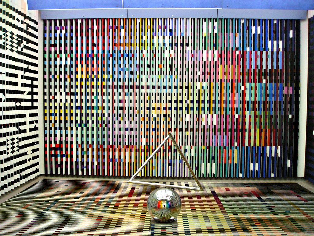
The modern art museum of the Centre Georges Pompidou houses a most curious work of art: a multi-coloured room. All its walls, floor, and ceilings are covered with coloured geometric patterns, and the entrance is enclosed with transparent plastic screens of different colours. This is a work by the Israeli Yaacov Agam. In 1971 he got this commission from the French President Georges Pompidou, who asked him to decorate the antechamber at his Elysee Palace suite.
President Pompidou loved, gathered and collected modern art; so, he initiated the construction of an art centre in Beaubourg that was to be opened after his death already and named after him. But one can hardly imagine a visitor who could enter such a reception room and avoid a genuine psychological shock. The interior by Yaacov Agam, completed in 1974, indicates how colour can turn an ordinary space into a dramatic, depressive, joyful or simply mad one. Anyway, the following President Valery Giscard d’Estaing wanted this room to be hidden from sight, and finally it joined the Centre Pompidou collection. Visitors are no longer allowed inside, but even having a look at it excites you as much as a sound attack at a rock concert.

The interior by Yaacov Agam
This work is now almost 30 years old, but the ideas of colour space arrangement are quite modern. The spatial influence of light was the theme of a grandiose installation by the sculptor Daniel Buren, shown last spring. He erected it at the Grand Palais, where Monumenta one-man shows by modern monumentalists are held.
The Grand Palais nave is a huge space as large as a train terminus, under a glass vault 45 metres high. Buren suspended transparent orange, green, and sky-blue disks some four metres high above the ground. As the Palais aquarium is flooded with sunshine, light passing through the disks would dye everything underneath – including the viewers – the same colour. It was a striking experience of light – on the ground, in the air and even on the visitors. Paris hadn’t seen so many red-headed beauties – but just as many ugly blue-haired creatures – for a long time.
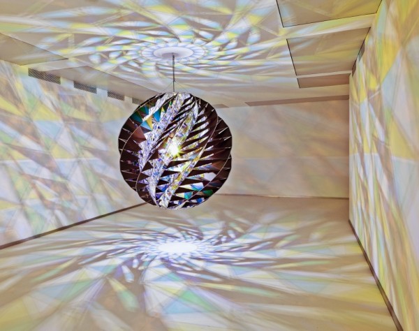
And the absence of colour is just as shocking as too much colour. This was demonstrated by the 2011 show by Olafur Eliasson at the Pinchuk Art Centre in Kiev. One of the halls was so lighted that human eye could not distinguish colours. Existence in a black-and-white environment, with even live people around discoloured, is one of the most surprising artistic impressions that one can experience.
It actually tells what artists used to say in early last century. Colour is life, colours do affect us; the red imparts warmth and the white chills. A theory applicable to everything, including art and wine.

Olafur Eliasson at the Pinchuk Art Centre in Kiev


